Responsive Web Design
OnPoint 11.5 supports the responsive web design. A website using the Responsive Web Design approach can be viewed on multiple platforms, such as desktop, mobile and tablet, without losing out on resolution, content and design. Based on screen size, platform and orientation, the web pages and its content adapt to different platforms without losing out any information. Responsive web design obviates the need for different web designs for different devices.
NOTE: | It is recommended to use iPhone 6 and above for using Responsive OnPoint web-GIS application. Safari version of iPhone 5 is not supported. |
The following figure shows an example of responsive OnPoint web-GIS application on a mobile.
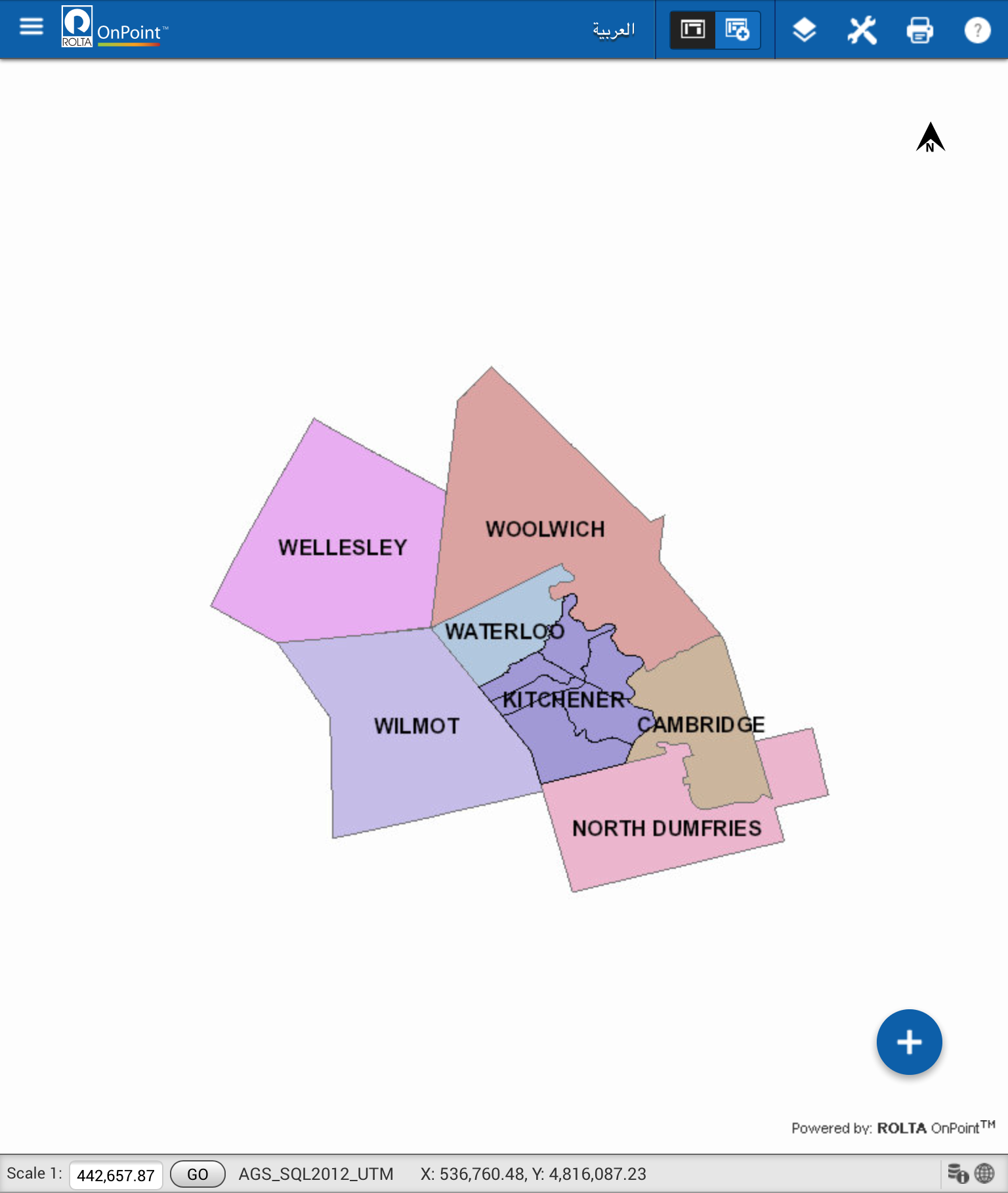
The following figure shows an example of responsive OnPoint web-GIS application on a tablet.
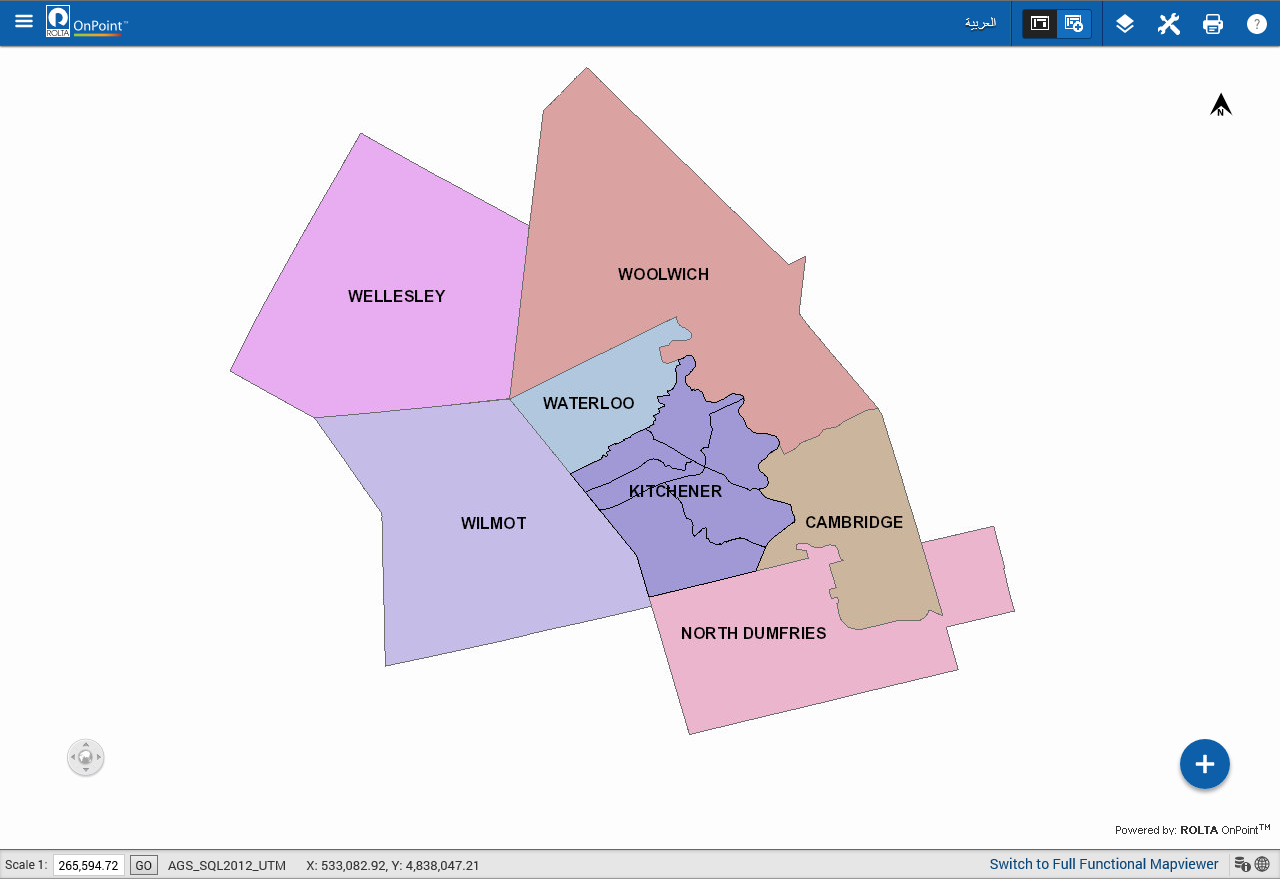
The following figure shows an example of responsive OnPoint web-GIS application on a desktop.